
Much has been made of the “shape” of the economic recovery in the wake of the COVID pandemic. Though the pandemic is (still) ongoing, the emerging narrative among economists and the data is that in many ways we experienced a K-shaped recovery through 2020 and 2021. This means that some - in this case higher-educated, higher-earning individuals who are typically able to work from home - had their income and wealth rebound and even quickly surpass pre-pandemic levels, while others - low-wage workers who may have lost their job in the recession or hold no financial investments - were stuck in decline or only partial recovery. The evidence in the employment data for this notion has been clear, while wage growth among low-wage jobs has actually been strengthening in recent months (though many of the recent wage gains have been erased by inflation). Both the stock market and unemployment rate underwent massive fluctuations in the wake of the March 2020 shutdowns. Government stimulus further complicated the inequality picture, providing significant but temporary relief to both the unemployed and middle-class Americans. But employment and the stock market aren’t the only way we can measure well-being or even economic impact. Another important measure is how individuals spend their time.

Source: FRED for employment numbers, Yahoo! Finance for S&P 500 Index
To examine statistically how Americans are spending their time, I want to turn to what I believe is one of the most interesting and unique US government datasets: the American Time Use Survey, or ATUS. The ATUS collects comprehensive information on thousands of individuals every month, ranging from demographic characteristics (age, race, location, etc.) to detailed minute-by-minute “time diaries” of how exactly they spent their previous day. If done correctly, we can summarize the ATUS data to get reasonable estimates of how different groups of people spend their time - such as how the average day varies by income (though there are still some potential issues in the data). To set aside discussion of how time-spending habits evolved over long periods of time, I’m going to restrict the analysis to the 2019 data. So I’ll be comparing the 2020 “COVID era” to the 2019 “pre-COVID era” (ATUS data for 2021 is not yet available).
The Broader Context
First off, let’s note that through the 2020 COVID recession, employment for high-income households remained fairly stable while low-income households spiked in both unemployment and out-of-the-labor force rates. While employment among low-income households remained below pre-COVID levels, the stock market boomed. And the households that tend to own significant amounts of stocks? High-income households.
One more note: income information in the ATUS was only collected for those who were employed at the time of the survey. Therefore when I group results by income levels, I’ll be missing those who were unemployed, which may bias the results. This is especially true for the low-income group since they were more likely to be unemployed through the COVID recession. So keep in mind as I present the comparisons that they are among those who were employed at the time of the survey and thus potentially not representative of the larger universe of Americans (which includes unemployed and those not in the labor force - at least 35% of adults).
Characteristics of the Rich and the Poor
To compare the time use habits of the “rich” and the “poor”, I need to define the actual compositions of these groups (at least for the purposes of this article). I took the weekly earnings variable, which was available for about half of the entire ATUS respondents sample, and multiplied it by 52 to generate a proxy of yearly income. This is an imperfect measurement of income since it assumes respondents earned income every week of the year, and the original earnings variable is missing for many people. Weekly earnings are also top coded at $150,000 to protect the privacy of high-earning respondents. So instead of relying on this income measure exactly, I’m going to place respondents into two bins: “low-income” if their projected yearly income is below $30,000 and “high-income” if it’s above $120,000. These amounts roughly correspond to the 25th and 75th household income percentiles in the U.S. in 2020. This still isn’t a perfect measure of economic status - it’s missing important dimensions of status like wealth and assets, it doesn’t account for the local cost of living, and who is missing income data likely isn’t random - so take that as a caveat for all below results. However, I think it does give us a rough capture of low-income and high-income status people in 2020 to compare against each other.

After weighing the sample to be representative of the entire U.S. population, my measure classifies about 30% of respondents as low-income and about 10% as high-income. Men are disproportionately high-income relative to women: while women make up nearly 63% of the low-income group, they are only 28% of the high-income group. High-income respondents are also on average 8 years older (46 vs. 38 years old), more likely to be Asian, and less likely to be Black than the low-income group. Among those employed at the time of the survey, 45% of low-income respondents were part-time workers, compared to only 3% of high-income respondents. Overall, the data shows these two groups are composed of significantly different types of people - this likely plays a significant role in how the pandemic shifted activities for the people in these groups in disparate ways.


Note: for building and grounds cleaning and maintenance, there were no respondents in the high-income tier that had that occupation, hence the thick single low-income bar.
Since we’re focused on the effect of COVID on time use, it’s important to note how the pandemic affected how work could actually be done. Of those who responded to the question, 58% of high-income workers were working remotely due to COVID-19, while only 14% of low-income workers were working remotely. On the other hand, only 6% of high-income workers were unable to work due to COVID-19 compared to 21% of low-income workers. The higher prevalence of remote work for higher-earning people, and the higher rate of pandemic-induced job loss, is both a reflection of the inequalities worsened by the pandemic as well as a driver in the time use trends that I will look at next. So before even looking into the time use data, we can already see how differently the pandemic affected everyday life for these two groups (and how different they were to start).
Time, time, time - 2019 vs 2020
Okay, now that I’ve provided an armful of caveats and some contextual information, it’s time to dig into the actual time data. I’d like to compare how our income groups were spending their time in 2019 and 2020, before and then during the onset of the pandemic and remote work. ATUS collects information on over 250 activities, so I’m going to focus on several of what I deem to be the more interesting and important for the purposes of this article. The categories I include below represent over 90% of the total time in the day for each group and year. While there is likely interesting variation in many of the other, smaller categories, I’m going to stick to these representative categories. First, I’m going to compare our entire groups of rich and poor in these major activity categories.

Before looking at how time use diverged, we can already see the many ways these groups were different pre-pandemic. High-income respondents spent more of their days, on average, working and on recreation activities, while low-income respondents did more leisure activities. I’d like to again note that these are major activity categories that encompass all manner of actual tasks, so that labels like “leisure” or “traveling” should be interpreted loosely. Also of note is how working, traveling, and shopping time dropped for both groups - replaced by more personal care, leisure, and homecare activities. Only in sports/recreation/exercise do we see diverging trends in time use. So an initial look at the data actually provides potential evidence against divergence!
Next, we can look at how each group’s time-spending habits changed only among those that actually participated in those activities. For some categories - the ones in which basically everyone does at least a little of each day like sleeping or eating - this won’t change anything. But for others that vary on the external margin, this can provide a more comparable subset of people (such as those who are working or who participate in sports) to measure how our groups may diverge.

We now see that among those working through the pandemic, time spent on work dropped much more dramatically for the rich than the poor. While 30 minutes less of work may not seem like much, on the scale of millions of people reducing their working time every day, this can have massive economic effects. This is similarly true for the drops in traveling among the rich and in recreation among the poor - small shifts by an entire population could cause the rise or fall of certain industries. As I highlighted in a previous post, the changing habits of people when it comes to activities like eating out can doom businesses already operating on razor-thin margins. However, making any forecasts is premature even now, with how permanent these trends may be still an open question. As of April 2022, many companies are still grappling with whether to bring workers back to the office and for how many days a week!
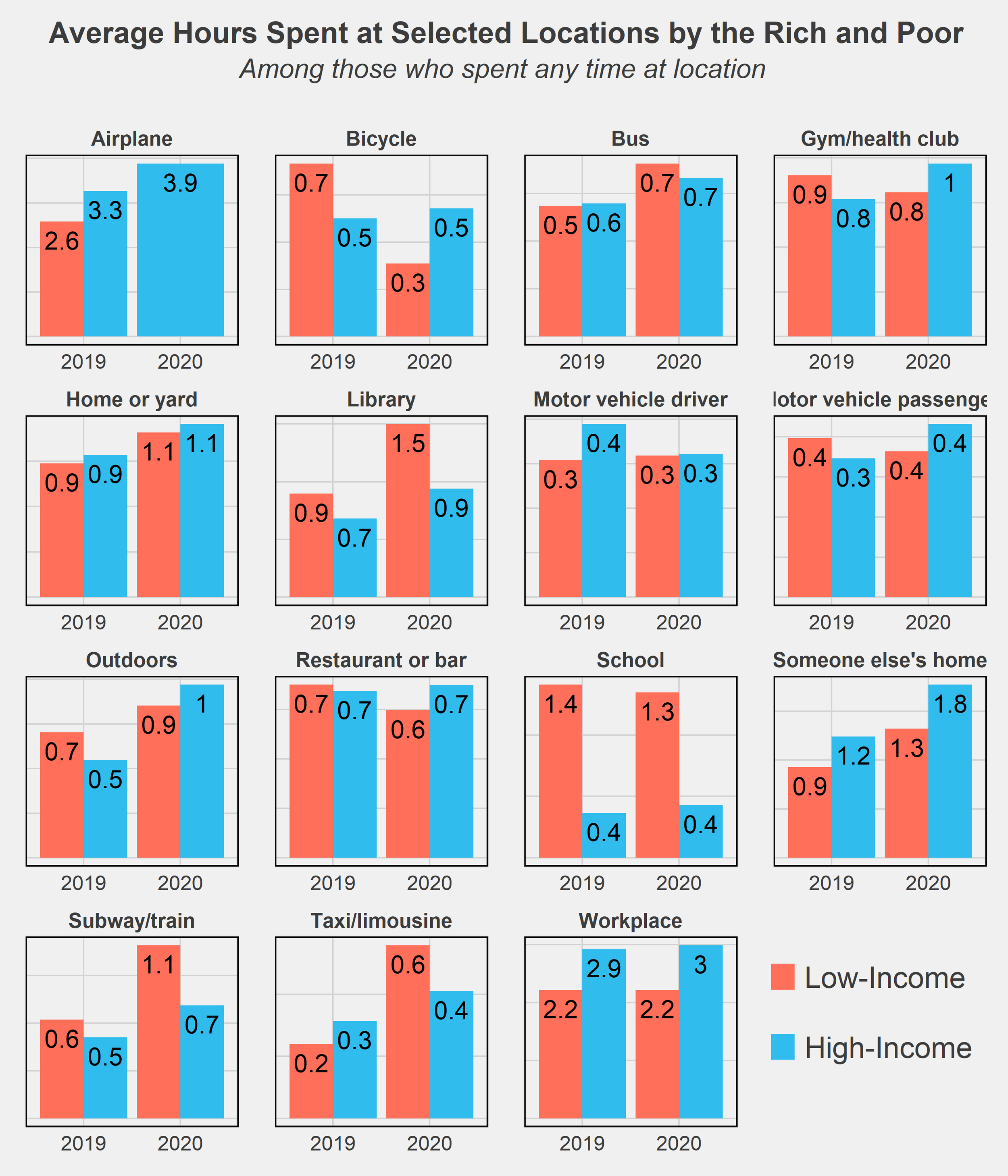
One last chart I wanted to throw in is comparing the time use of rich and poor by the locations of where they spent their time. There aren’t too many surprises here - high-income respondents spend more of their time on airplanes while the low-income spend more on subways and bicycles, generally cheaper modes of transportation. The much higher amount of time spent in libraries and schools by low-income respondents is likely due to many students not working (or only working part-time jobs) while in school and thus falling into that low-income group.
Conclusion
It’s no secret that inequality has worsened in the U.S., a trend beginning at least as far back as the 1970s. The Great Recession was an exacerbator of this trend, as recessions tend to do, and the COVID recession may have further accelerated the growing divide. One key difference, however, is the government's response to these recessions. Most economists will agree that the federal government did a much better job of supporting its citizens following this most recent crisis. The eviction and student loan moratoriums, expanded unemployment benefits, and stimulus checks were among many policies that reduced the severity of the downturn and quickened recovery. This may in part explain the lack of divergence in time use habits as seen in the data above. Yet both the effect of the pandemic and the shape of the recovery remain to be seen. The U.S. continues to struggle with inflation and supply chain issues, and the threat of falling back into recession is non-negligible. Reversing the decades-long increase in inequality will also take much more than temporary relief programs. While the COVID pandemic certainly worsened inequality in many ways, it was not the start nor will it be the end of diverging circumstances and futures for the nation’s rich and poor.
Final Notes
All facts and figures in this post were created from weighted ATUS data. Weights used come from the WT20 variable in the IPUMS data. As their data description notes, “WT20 does not yield annual estimates. It is designed to provide estimates that are representative of the period from January 1 through March 17 and May 10 through December 31. This weight omits the March 18 to May 9 period because 2020 data were not collected on these days due to the COVID-19 pandemic. This weight is required for analyses that include 2020 data.”
ATUS data: https://www.bls.gov/tus/database.htm
IPUMS Citation: Sandra L. Hofferth, Sarah M. Flood, Matthew Sobek and Daniel Backman. American Time Use Survey Data Extract Builder: Version 2.8 [dataset]. College Park, MD: University of Maryland and Minneapolis, MN: IPUMS, 2020. https://doi.org/10.18128/D060.V2.8Â
Charts seen in this post were made in R using the tidyverse, readxl, and ggthemes, directlabels, and RColorBrewer packages. Data was downloaded from IPUMS and cleaned using Stata.
In the future, I’d like to revisit this post with two extensions: delve more into the subcategories of time use and see in more detail how the rich and poor vary their activities at a more granular level, and try out a matching procedure to pair rich and poor on dimensions of education, age, race, etc. The latter method would allow for a (potentially) causal comparison of the two groups’ time usage and may provide more interesting insight into how otherwise-similar people diverge in their daily habits on the basis of income. These were my original plans for this post but I had to stop short as personal matters got in the way - but I hope to return to it when there is more data later on!
If you have questions or constructive feedback, feel free to email me at troded24@gmail.com, submit an inquiry on this website, or leave a comment on this post! Thanks for reading.