
A K-Shaped Recover in Time? The COVID-19 Pandemic’s Effect on the Time-Spending Habits of the Rich and the Poor
Much has been made of the “shape” of the economic recovery in the wake of the COVID pandemic. Though the pandemic is (still) ongoing, the emerging narrative among economists and the data is that in many ways we experienced a K-shaped recovery through 2020 and 2021. This means that some - in this case higher-educated, higher-earning individuals who are typically able to work from home - had their income and wealth rebound and even quickly surpass pre-pandemic levels, while others - low-wage workers who may have lost their job in the recession or hold no financial investments - were stuck in decline or only partial recovery. The evidence in the employment data for this notion has been clear, while wage growth among low-wage jobs has actually been strengthening in recent months (though many of the recent wage gains have been erased by inflation). Both the stock market and unemployment rate underwent massive fluctuations in the wake of the March 2020 shutdowns. Government stimulus further complicated the inequality picture, providing significant but temporary relief to both the unemployed and middle-class Americans. But employment and the stock market aren’t the only way we can measure well-being or even economic impact. Another important measure is how individuals spend their time.

Source: FRED for employment numbers, Yahoo! Finance for S&P 500 Index
To examine statistically how Americans are spending their time, I want to turn to what I believe is one of the most interesting and unique US government datasets: the American Time Use Survey, or ATUS. The ATUS collects comprehensive information on thousands of individuals every month, ranging from demographic characteristics (age, race, location, etc.) to detailed minute-by-minute “time diaries” of how exactly they spent their previous day. If done correctly, we can summarize the ATUS data to get reasonable estimates of how different groups of people spend their time - such as how the average day varies by income (though there are still some potential issues in the data). To set aside discussion of how time-spending habits evolved over long periods of time, I’m going to restrict the analysis to the 2019 data. So I’ll be comparing the 2020 “COVID era” to the 2019 “pre-COVID era” (ATUS data for 2021 is not yet available).
The Broader Context
First off, let’s note that through the 2020 COVID recession, employment for high-income households remained fairly stable while low-income households spiked in both unemployment and out-of-the-labor force rates. While employment among low-income households remained below pre-COVID levels, the stock market boomed. And the households that tend to own significant amounts of stocks? High-income households.
One more note: income information in the ATUS was only collected for those who were employed at the time of the survey. Therefore when I group results by income levels, I’ll be missing those who were unemployed, which may bias the results. This is especially true for the low-income group since they were more likely to be unemployed through the COVID recession. So keep in mind as I present the comparisons that they are among those who were employed at the time of the survey and thus potentially not representative of the larger universe of Americans (which includes unemployed and those not in the labor force - at least 35% of adults).
Characteristics of the Rich and the Poor
To compare the time use habits of the “rich” and the “poor”, I need to define the actual compositions of these groups (at least for the purposes of this article). I took the weekly earnings variable, which was available for about half of the entire ATUS respondents sample, and multiplied it by 52 to generate a proxy of yearly income. This is an imperfect measurement of income since it assumes respondents earned income every week of the year, and the original earnings variable is missing for many people. Weekly earnings are also top coded at $150,000 to protect the privacy of high-earning respondents. So instead of relying on this income measure exactly, I’m going to place respondents into two bins: “low-income” if their projected yearly income is below $30,000 and “high-income” if it’s above $120,000. These amounts roughly correspond to the 25th and 75th household income percentiles in the U.S. in 2020. This still isn’t a perfect measure of economic status - it’s missing important dimensions of status like wealth and assets, it doesn’t account for the local cost of living, and who is missing income data likely isn’t random - so take that as a caveat for all below results. However, I think it does give us a rough capture of low-income and high-income status people in 2020 to compare against each other.

After weighing the sample to be representative of the entire U.S. population, my measure classifies about 30% of respondents as low-income and about 10% as high-income. Men are disproportionately high-income relative to women: while women make up nearly 63% of the low-income group, they are only 28% of the high-income group. High-income respondents are also on average 8 years older (46 vs. 38 years old), more likely to be Asian, and less likely to be Black than the low-income group. Among those employed at the time of the survey, 45% of low-income respondents were part-time workers, compared to only 3% of high-income respondents. Overall, the data shows these two groups are composed of significantly different types of people - this likely plays a significant role in how the pandemic shifted activities for the people in these groups in disparate ways.


Note: for building and grounds cleaning and maintenance, there were no respondents in the high-income tier that had that occupation, hence the thick single low-income bar.
Since we’re focused on the effect of COVID on time use, it’s important to note how the pandemic affected how work could actually be done. Of those who responded to the question, 58% of high-income workers were working remotely due to COVID-19, while only 14% of low-income workers were working remotely. On the other hand, only 6% of high-income workers were unable to work due to COVID-19 compared to 21% of low-income workers. The higher prevalence of remote work for higher-earning people, and the higher rate of pandemic-induced job loss, is both a reflection of the inequalities worsened by the pandemic as well as a driver in the time use trends that I will look at next. So before even looking into the time use data, we can already see how differently the pandemic affected everyday life for these two groups (and how different they were to start).
Time, time, time - 2019 vs 2020
Okay, now that I’ve provided an armful of caveats and some contextual information, it’s time to dig into the actual time data. I’d like to compare how our income groups were spending their time in 2019 and 2020, before and then during the onset of the pandemic and remote work. ATUS collects information on over 250 activities, so I’m going to focus on several of what I deem to be the more interesting and important for the purposes of this article. The categories I include below represent over 90% of the total time in the day for each group and year. While there is likely interesting variation in many of the other, smaller categories, I’m going to stick to these representative categories. First, I’m going to compare our entire groups of rich and poor in these major activity categories.

Before looking at how time use diverged, we can already see the many ways these groups were different pre-pandemic. High-income respondents spent more of their days, on average, working and on recreation activities, while low-income respondents did more leisure activities. I’d like to again note that these are major activity categories that encompass all manner of actual tasks, so that labels like “leisure” or “traveling” should be interpreted loosely. Also of note is how working, traveling, and shopping time dropped for both groups - replaced by more personal care, leisure, and homecare activities. Only in sports/recreation/exercise do we see diverging trends in time use. So an initial look at the data actually provides potential evidence against divergence!
Next, we can look at how each group’s time-spending habits changed only among those that actually participated in those activities. For some categories - the ones in which basically everyone does at least a little of each day like sleeping or eating - this won’t change anything. But for others that vary on the external margin, this can provide a more comparable subset of people (such as those who are working or who participate in sports) to measure how our groups may diverge.

We now see that among those working through the pandemic, time spent on work dropped much more dramatically for the rich than the poor. While 30 minutes less of work may not seem like much, on the scale of millions of people reducing their working time every day, this can have massive economic effects. This is similarly true for the drops in traveling among the rich and in recreation among the poor - small shifts by an entire population could cause the rise or fall of certain industries. As I highlighted in a previous post, the changing habits of people when it comes to activities like eating out can doom businesses already operating on razor-thin margins. However, making any forecasts is premature even now, with how permanent these trends may be still an open question. As of April 2022, many companies are still grappling with whether to bring workers back to the office and for how many days a week!
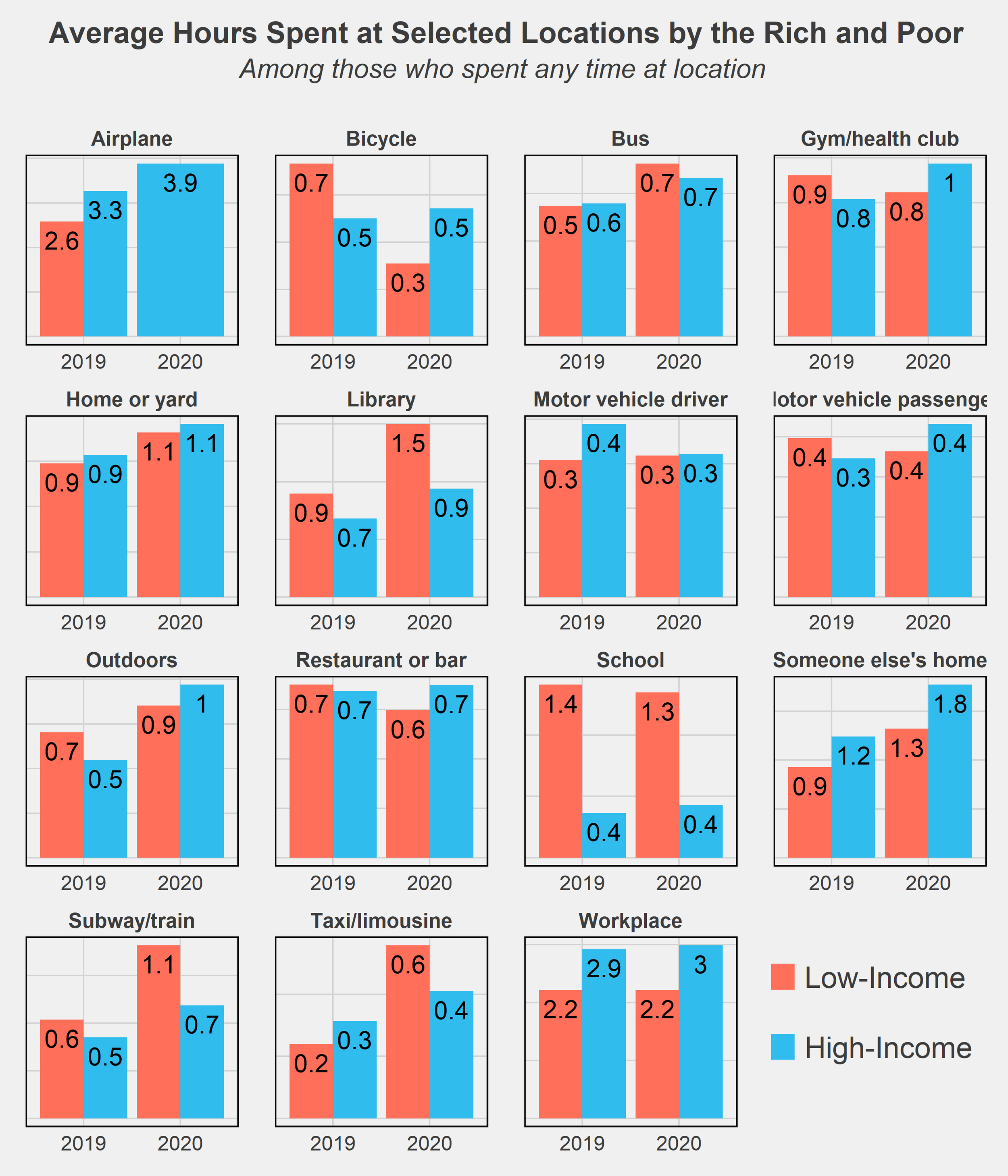
One last chart I wanted to throw in is comparing the time use of rich and poor by the locations of where they spent their time. There aren’t too many surprises here - high-income respondents spend more of their time on airplanes while the low-income spend more on subways and bicycles, generally cheaper modes of transportation. The much higher amount of time spent in libraries and schools by low-income respondents is likely due to many students not working (or only working part-time jobs) while in school and thus falling into that low-income group.
Conclusion
It’s no secret that inequality has worsened in the U.S., a trend beginning at least as far back as the 1970s. The Great Recession was an exacerbator of this trend, as recessions tend to do, and the COVID recession may have further accelerated the growing divide. One key difference, however, is the government's response to these recessions. Most economists will agree that the federal government did a much better job of supporting its citizens following this most recent crisis. The eviction and student loan moratoriums, expanded unemployment benefits, and stimulus checks were among many policies that reduced the severity of the downturn and quickened recovery. This may in part explain the lack of divergence in time use habits as seen in the data above. Yet both the effect of the pandemic and the shape of the recovery remain to be seen. The U.S. continues to struggle with inflation and supply chain issues, and the threat of falling back into recession is non-negligible. Reversing the decades-long increase in inequality will also take much more than temporary relief programs. While the COVID pandemic certainly worsened inequality in many ways, it was not the start nor will it be the end of diverging circumstances and futures for the nation’s rich and poor.
Final Notes
All facts and figures in this post were created from weighted ATUS data. Weights used come from the WT20 variable in the IPUMS data. As their data description notes, “WT20 does not yield annual estimates. It is designed to provide estimates that are representative of the period from January 1 through March 17 and May 10 through December 31. This weight omits the March 18 to May 9 period because 2020 data were not collected on these days due to the COVID-19 pandemic. This weight is required for analyses that include 2020 data.”
ATUS data: https://www.bls.gov/tus/database.htm
IPUMS Citation: Sandra L. Hofferth, Sarah M. Flood, Matthew Sobek and Daniel Backman. American Time Use Survey Data Extract Builder: Version 2.8 [dataset]. College Park, MD: University of Maryland and Minneapolis, MN: IPUMS, 2020. https://doi.org/10.18128/D060.V2.8Â
Charts seen in this post were made in R using the tidyverse, readxl, and ggthemes, directlabels, and RColorBrewer packages. Data was downloaded from IPUMS and cleaned using Stata.
In the future, I’d like to revisit this post with two extensions: delve more into the subcategories of time use and see in more detail how the rich and poor vary their activities at a more granular level, and try out a matching procedure to pair rich and poor on dimensions of education, age, race, etc. The latter method would allow for a (potentially) causal comparison of the two groups’ time usage and may provide more interesting insight into how otherwise-similar people diverge in their daily habits on the basis of income. These were my original plans for this post but I had to stop short as personal matters got in the way - but I hope to return to it when there is more data later on!
If you have questions or constructive feedback, feel free to email me at troded24@gmail.com, submit an inquiry on this website, or leave a comment on this post! Thanks for reading.

Is There A Student Loan Bubble? - Part II
Part I of my exploration of the current state of the student loan market basically established the groundwork. Key takeaways are that the majority of federal student loans are now Direct Loans (which are lent by the federal government itself and carry interest rates in the 5%-7.6% range) and that while debt is spread across several types of schools, public schools contain the most borrowers by far and private schools have the highest average balance. None of these facts really come across as shocking, but they do provide us the context to look at some of the more interesting statistics that will be shown in this post.
As I said last time, the goal of this project is to ask, “What level of worry should we have regarding the state of the student loan market?” Obviously the market is large, and undoubtedly the growth of student loan portfolios has become a heavy burden for many students. But are we in a bubble that’s about to pop, are we in a dangerous situation that still has time to be fixed, or are we just witnessing the natural growth of what will become a central loan market in the United States? The next financial crisis, a paradigm shift, or something else? With Part II of this project I hope to shine some light on the answers to that question.

Note: Totals represent the value at the end of Q4 for each respective year (Sep. 30) except for 2018, in which data is currently available up to end of Q2 (Mar. 30). 2018 numbers can be expected to be somewhat larger by end of Q4 2018.
One key component toward reaching a (hopefully) somewhat accurate prediction is to simply look at growth of total student loan balances. Again using federal data, we see a depiction of a clearly surging market. Since 2007, the total outstanding balance of federal student loans has increased from $516 billion to over $1.4 trillion. This represents a 173% cumulative growth of student loan balances from 2007 to (the data we have so far on) 2018. However, we actually see that loan growth has slowed down relatively in recent years, with yearly growth around half what it was a decade ago. One likely explanation for this is improved economic conditions. Household wealth and income were severely diminished not only during the financial crisis but for several years afterward (and arguably still are) as recovery remained sluggish. The housing bust also served to drastically impact household wealth as home prices plummeted and many Americans experienced foreclosure. While some of these effects are still ongoing, such as housing prices remaining depressed in many regions, economic conditions in 2018 are certainly much improved for the majority of Americans. Unemployment is at a historical floor and household income is the highest it has ever been. Thus we see a slowdown in the student loan market as less financing is required to pay for tuition.
Still, overall economic health is not the only determining factor of loan generation, and especially in the case of student loans there is much more at play. As discussed before, rising costs of tuition and number of college attendees are just two of the most basic aspects. Another way we can look at student loans is also by recipients rather than balances.

As expected we again see substantial growth in the market. Compared to balances, however, the growth in borrowers is not quite as dramatic. Since 2007, the number of borrowers has increased from 28.3 million to 42.6 million, a 51% total increase. Perhaps the growth doesn’t seem as impressive, but the fact that about 42.6 million people currently hold at least some student loans should be an eyebrow-raiser. Similar to the previous chart, we see a slowdown in growth, with growth rates even less than half of the Great Recession rates. We only have 1% growth in 2018, but seeing as how we also only have data on the first half of 2018 we can expect that number to go up by end of the year. Still, the 2% growth rates of recent years is much lower than sensationalist news and fear-mongers may lead one to expect.
Put together, these two charts tell us several things. The growth of the student loan market has, in general, been marked and strong. It has also slowed in recent years. And possibly most interesting is that the average amount each recipient has borrowed has increased, as the growth of loan balances has outpaced the growth of borrowers. This is where I believe the primary concern with student loans should focus. Growth of student loans isn’t necessarily bad and certainly not economically fatal. But such a pronounced rise of average loan portfolios is a concern. While the collective weight of student loans has eased up relatively, individual portfolio sizes continue to grow. A greater loan burden also often results in higher delinquency rates, which no one wants.

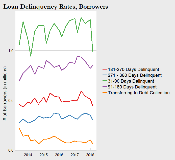
Here we have a chart of the total value of loan delinquencies, sorted by length of time delinquent, over time. Unfortunately, data was only available going back to 2013. In that period, we see a generally modest upward trend in every category of delinquency . The amount of student loans going unpaid, whether for a month or a year, has increased. We do see variation in the strength of that increase, with an inverse between length of delinquency and growth rate. We also see a downtick in the amounts for 2018, though again this may just be due to lack of complete data for the year or noise in the data. So clearly higher delinquency rates are bad. But a total increase in student loan balances can be expected to correlate with greater delinquency balances. A bigger pie is going to have bigger slices. While $30 billion sounds like a lot, it is only 2% of the $1.4 trillion outstanding total balance in 2018. The situation is not as dire as it may seem. Still, I see this as the main area of concern as high delinquency rates are the real warning sign for the market - something to be closely monitored. If/when another recession occurs, it would be expected that the ability of students and young adults to complete payments on their loans will become diminished. So while rates are relatively low now, the situation could quickly become worrisome given an economic downturn.
For consistency and further context here is the chart of delinquency rates by borrower counts as well. The trends are in line with the balances chart above and we can draw basically the same information.
Conclusion
That concludes (for now) my first look into the current state of the student loan market. There are plenty more statistics equally relevant and significant to consider, but I think we have seen enough to draw some basic conclusions. Student loans have expanded to a formidable size that place it among the giants of the loan markets. By all measures the already large portfolios for students have blown up in the past decade. Yet at the same time, we see signs of stability. Delinquency rates have not grown proportionally with total balances, and overall growth has slowed down in the past few years. Safe to say the situation is not dire as it currently stands. We must be forward-looking however. As I noted above, the next recession has potential to cascade into a much more severe situation for those with student loans. Especially those who attended private schools and are now carrying $30,000+ balances, or those working jobs that have stagnant wages, or a multitude of other scenarios that exist in the current economy.
Since these loans are now completely government-owned, a financial crisis caused by student loans is unlikely. But a crisis or economic downturn originating elsewhere is directly tied to the student loan situation and can result in a negative feedback loop. How to resolve this is a question with many possible answers. Finding ways to lower tuition costs and cap tuition growth, providing additional financial aid and other support for students, or a variety of other solutions proposed and enacted may be the key. Some combination is likely the answer. Whether they will be implemented and how soon is another important question.
For fun, one more figure I created is the geographic disparity of student loans. As most people could guess, states like California and New York are at the top in student loan debt by total balance and total borrowers. They also have some of the largest populations and top colleges, so no surprise there. I thought it would be much more illuminating to examine how the average student loan balance differs from the national average balance by state.

I’m not entirely sure why Colorado is one of the best and Georgia/Maryland one of the worst - it may have to do with state laws or likely other localized factors. Maybe it will be the subject of a future student loans post! I would also love to hear from any readers from these states or knowledgable about these states if they know why or have any of their own theories.
Final Notes
Other notes on overall data: Total may not be exactly equal to 100% or the sum of their parts due to rounding. Time-series data is by federal fiscal year which ends September 30. Data for 2018 is currently available for up to Q2 which ends March 30, 2018. “Recipient” refers to the receiver of the loan, most often the student but can also be the parent of said student.
Loan Delinquencies: Includes outstanding principal and interest balances of Direct Loan borrowers in the Repayment status as identified in Direct Loan Portfolio by Loan Status Report. While technical default is 271 days delinquent, default is defined as 361 days delinquent for reporting purposes to ensure consistency with Federal Family Education Loans (FFEL) reporting. Loans already transferred to DMCS are not included in this report. Recipient counts are based at the loan level. As a result, recipients may be counted multiple times across varying loan statuses.
For more information on the differences between loan types and details on the terms of each, check out https://studentaid.ed.gov/sa/types/loans and https://studentaid.ed.gov/sa/sites/default/files/federal-loan-programs.pdf.
Data was collected from https://studentaid.ed.gov/sa/about/data-center/student/portfolio, cleaned and transformed in STATA, then visualized using ggplot2 in R.

Is There A Student Loan Bubble? - Part I
A subject that I have found personally engaging, and is undoubtedly rising in importance every year, is the student loan market. More Americans are enrolling in college than ever before, and a college education is increasingly crucial for any chance at social mobility or simply a stable career. The proportion of jobs requiring at least a bachelor’s degree has been growing for decades now. At the same time, the cost of a college education - predominantly tuition, but also other relevant costs such as textbooks and housing - has skyrocketed. Attending an average 4-year university today costs more than twice as much as in 1986 (with CPI adjustment) based on tuition alone. Clearly the cost of college has outpaced inflation, and more importantly it has outpaced the growth of household income. So we have record numbers of Americans attending (see: paying) for college and soaring tuition and living expenses. The result of these intersecting trends is the explosive growth of student loans. The student loan market is one of the biggest loan markets today, larger than any other besides the mortgage market. Families and students unable to pay out-of-pocket for college are forced to take out loans or find another route. And while this is definitely an option - community colleges, scholarships, and trade jobs are all viable and persuasive - many choose loans. The number of individuals with student loans is higher than ever before, and the average amount of student loans per individual is greater than ever before.
Okay, so we’ve established the fact that the student loan market is big. This is a well-known and hot topic, as worries of the student loan burden grow with the market. Why are people so worried about student loans? Not too long ago we had this subprime mortgage crisis which was partially rooted in another loan market getting a little too big for its own good. Without oversimplifying the Great Recession too badly, the pop of the housing bubble resulted in one of the worst financial crises and economic downturn in America’s history. So it’s fair to say that there remains a degree of wariness for people taking out loans they can’t afford. But again, let’s not oversimplify things. Loans aren’t necessarily bad. Used responsibly they can relieve financial burdens, offer opportunities to open business or buy homes, and build credit. In the case of student loans, they offer working-class and low-income families especially the opportunity to provide their children the same higher education as the richest families.
So how do we know if the current state of the student loan market is cause to ring alarm bells, or if it’s too early to overreact?
We need to dive into the details of these loans and break down where they’re going, who they’re going to, and what’s being done with them. If that sounds vague, don’t worry - we are about to get a lot more specific. My goal is to paint a comprehensive picture of today’s student loan market by attributing significance to every relevant factor available. This means looking at loan terms, loan types, loan portfolios, and loan delinquency rates among other measures. Like modern economics, we need to build a model that builds from the ground up if we want to accurately portray the student loan market and possibly predict where it's headed. Of course, this isn’t really something that can be accomplished in just one blog post or even a series of them. But if I can make a start, and perhaps contribute to the ongoing conversation regarding a “student loan bubble”, then I would consider that a success.
One last thing before we jump into the data. As always, I have to provide some explanations and disclaimers concerning the data itself. At least for this post, I will only be looking at federal student loans. I pulled all data for this project from https://studentaid.ed.gov/sa/about/data-center/student/portfolio, which proved an amazingly useful data source but sadly limited to only federal loans. In 2018, total student loan debt in the US is at $1.2 trillion, with about $1 trillion of that being held or guaranteed by the federal government. So while the data I use does not cover all student loans, it does cover a very great majority of it. Private student loans have different terms than federal loans however, so I would like to note that any claims about student loans in this post are meant solely for federal student loans and should not be applied to private student loans. That being said, let’s take a look at what the data tells us.
See final comments section for more information on the data.
To begin, I wanted to examine what types of loans comprise the market, and how that has changed over time.


Federal student loans can be broken down into three broad categories: Federal Family Education (FFE) Loans, Direct Loans, and Perkins Loans. FFE Loans was the main program for student loans in the USA, until 2010 when the government began phasing out the program. There were a variety of loans given out under FFEL, subsequently with a variety of interest rates, all capped at around 8-9%. The structural difference between FFE Loans and Direct Loans are that FFE Loans are made by private lenders and guaranteed by the federal government, while Direct Loans are directly (the name fits) lent to students by the federal government. Propelled by concerns that private lenders did not have students’ best interests in mind when providing loans, the government decided to take over the role banks and financial institutions had filled for decades. Thus since 2010 FFE Loans have been shrinking as Direct Loans take their place as the primary offering of federal student loans. Direct Loans carry interest rates between 5.05%-7.6% depending on the type and, also depending on the type, contain different terms of when payments and interest accumulation begin on the loans. The fact that the vast majority of student loans are now provided strictly by the federal government and not through private lenders is significant. That changes not only the terms of these loans but their nature and purpose. We’ll revisit this later when after looking at some more graphs.
The third category of federal student loans, comprising less than 1% today, are Perkins Loans. The Perkins program offers perhaps the friendliest terms - 5% fixed interest rate, no interest accrued while a student or until 9 months after graduating, and loan forgiveness paths for those who enter public service and take on roles such as teachers or nurses. However these loans also have some more strict requirements regarding limits and student status. In September 2017, Congress failed to renew the Perkins program, and so no Perkins loans have been granted for the new school year. Thus federal student loan offerings today can be narrowed down to the Direct Loans program, although 21.5% of existing student loans are still from the other two "dead" programs.

Another helpful way to break down our student loan data is by school types. I narrowed it down to three types of schools - public, private, and proprietary (a.k.a. for-profit) schools. Clearly public schools are a plurality of the student loan outstanding balance as of the end of March 2018, but this is also because public schools make up nearly half of all student loan recipients. What could make for a more interesting comparison is how the average student loan portfolio diverges by school type.

The average loan balance for a student attending a private school in 2018 is $35,052. Ouch. That’s over ten grand greater than the next highest average balance, at public schools. Not very surprising, since tuition at private schools are much higher than at public schools. It is shocking however to see how substantial student loan balances have become overall. Public universities, once considered the cheaper and more affordable path of higher education, are now turning out students with nearly a quarter of a hundred grand in debt. Taking into account that interest rates on these loans ranges anywhere from 5% up to 8.5%, you arrive at a fairly significant burden for newly-graduated students. Entering a job market that has been mired in stagnant wages and ever-increasing qualification requirements, it isn’t difficult to understand how many young adults may fail to make payments, or at the very least pay down interest, on their student loans. The result is a quick build-up of the loan balance, further punishing already struggling students. Also consider that those numbers are just the average, so there are many students with outstanding balances even greater than in the numbers in the graphic above. It also doesn’t include private loans, which could even contain potentially larger interest rates. Due to the growing student loan burden, failing to land on your feet with a well-paying job straight out of college transforms from a moderate concern to a financial death sentence.
I’m going to pause here. So far I have set the foundation and background on today’s student loan market, categorized the loan types of the last decade, and broken down where these loans are by school type. Next time I will look at the actual growth of loan balances and recipients over time, provide a geographic context to the federal student loan market, and examine loan delinquency rates. Stay tuned, and in the meantime, you might want check your own student loan portfolio to see how you compare.
Final Comments
Note: More information and resources on student loans are available at lendedu.com. For an especially deeper dive into the pros and cons of private student loans see https://lendedu.com/blog/what-to-consider-before-taking-out-a-private-student-loan/.
Other notes on overall data: Total may not be exactly equal to 100% or the sum of their parts due to rounding. Time-series data is by federal fiscal year which ends September 30. Data for 2018 is currently available for up to Q2 which ends March 30, 2018. “Recipient” refers to the receiver of the loan, most often the student but can also be the parent of said student.
Loan School Types Notes: Balance is total outstanding principal and interest balances of federal student loans in Q2 2018. "Other" includes consolidation loans made prior to 2004 that cannot currently be linked to a specific school in the Enterprise Data Warehouse. Includes Direct Loan, Federal Family Education Loan, and Perkins Loan borrowers in an Open loan status. Recipient counts are based at the loan level. If a recipient received loans from more than one school type, they are counted in each applicable school type. There were also two other categories in the data: foreign schools and “other”. Since foreign schools only constituted about 1% of the total loan market I decided to exclude that category. “Other” was a bit more significant, about 6% of the total loan balance, but that category simply consists of loans that cannot be traced to a specific school (due to consolidation or other factors) so I also decided to exclude it.
For more information on the differences between loan types and details on the terms of each, check out https://studentaid.ed.gov/sa/types/loans and https://studentaid.ed.gov/sa/sites/default/files/federal-loan-programs.pdf.
Data was collected from https://studentaid.ed.gov/sa/about/data-center/student/portfolio, cleaned and transformed in STATA, then visualized using ggplot2 in R.

The CEO Investment Strategy: Part II
Part II of the CEO Investment Strategy project is here, and this time we’re going to be looking at some different sectors’ historical performance. In Part I I focused on the tech sector. For almost all the companies we looked at, they had significantly outperformed our S&P 500 Index in terms of growth. Now we’re going to look at the financial and food sectors, where perhaps less “growth-driven” stocks may not have had such explosive returns over their timeline. Let’s jump back into it.
The Financial Sector

Here we have a collection of big banks, plus Visa (financial services). Unfortunately we do not have as much historical information for these stocks compared to tech, especially for Visa and Goldman Sachs. One apparent and predictable trend we do have, however, is the effect of the 2008 financial crisis. Let’s focus on that for a moment.

The 2008-2009 drop in financial sector stocks is significant - as it is for the entire market as well. The Great Recession was rooted in the financial crisis, and that is readily apparent in the drop to the earth’s core by BAC. Yet we also see an impressive rally by the stock market as the S&P 500 Index recovered its value by 2013. At the same time, we also see the effect of a booming economy (and perhaps tax cuts?) helping along the recovery in 2017 and 2018.

This is a brutal chart to look at. Bank of America was hit hard by the financial crisis, the worst Great Recession performance of any of the stocks I looked at. Credit where it is due, however, to Brian Moynihan. Under his leadership BAC recaptured stable ground and has even been surging in recent years. Still plenty of ground to make up though. Ultimately I see BAC’s chart as a fitting proxy for the pattern of the financial sector in the 21st century. Unsustainable growth followed by a near-fatal crash and then back to fast growth (though more slow and cautious than before the recession).
Note: Although I had historical data on BAC going back to the 1980s, I could only find CEO information going back to Hugh McColl so had to cut off this chart at that point.

Goldman Sachs is an excellent example of two lessons learned from this project. First is that a company’s performance and value extends past just the growth of it’s stock price. While the stock hasn’t hit 4x it’s initial price (which makes it a lower bound for growth compared to many of the other stocks we have observed), it would be difficult to argue Goldman itself hasn’t grown tremendous amounts and become an industry giant in those same 19 years. Other measures are necessary to see those near-two decades of sustained success. The other lesson is that time in the market beats all other investment strategies. Just look at how quickly GS stock rebounded from the financial crisis! While not all stocks recovered quite so rapidly, and some have certainly been losing bets as well, I see this chart as an affirmation of the time-tested investing trope:
“Time in the market beats timing the market”.
Another interesting piece about Goldman Sachs in these charts is that it appears to be outperformed by the S&P 500 in the financial sector charts but outperforms the S&P 500 in this one. Again, this is because I indexed the performance of every stock to the available start date of that stock. So indexing the S&P 500 from the 1980s vs 1999 provides two different interpretations. And again, this is why the one-to-one charts provide a better representation to compare historical performance.

Jamie Dimon is one of the most well-known names in finance today. This chart provides some backing for the reason why. He could not have taken over a major financial institution at a worse time, just before the start of the financial crisis. But in the subsequent years he has navigated JP Morgan to new highs and taken place as not just leader of the big bank but of the entire financial sector.
The Food Sector

Let’s look at one more sector - food! Two of the biggest companies under this category are McDonald’s and PepsiCo. Unlucky for Pepsi to be compared to the fast food giant that has become a common household name. McDonald’s is so prevalent, especially in American culture, that Ronald McDonald ranks among one of the most recognized figures today. Few things are as symbolic of modern culture in the USA as the McDonald’s drive-thru. If they ever make a single museum to represent the power of capitalism, the golden arches should be the gateway to the entrance. But PepsiCo is impressive in its own right and no less talented at branding.
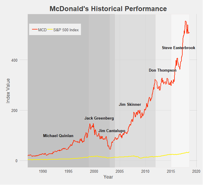
For such a successful company and fast growing stock, McDonald’s sure has gone through a lot of CEOs - five since the turn of the century. The successive chain of leaders attempting to follow Ray Kroc’s path have seen mixed results. The backlash against unhealthy foods in the mid 2000s, exemplified by Morgan Spurlock’s Super Size Me documentary released in 2004, contributed to MCD’s tumble in the early 2000s. However MCD has mostly seen good times and consistent growth, and the rebranding of recent years has really pushed the stock to all-time highs. Such a breakneck growth rate is practically unprecedented for stocks outside the tech sector.

Last but not least we have PepsiCo. It’s tough to place PEP under one label, as the food conglomerate has taken ownership of or become involved in dozens of popular snack foods, beverages, and other household items. What isn’t tough is praising Indra Nooyi’s leadership of the big brand, contributing to her consistently ranking as one of the world’s most powerful women. Her directives to rebrand PEP products and shift focus to more healthy options (though the results may be controversial) have brought the company over a decade of growth. Sadly for PepsiCo Nooyi recently announced her retirement from the CEO position, but she certainly leaves the company in good standing.
Conclusion
Besides all the other disclaimers and cautions I have given throughout these last two posts of the CEO Investment Strategy, one other to keep in mind is survivorship bias. It is easy to look at all the above charts and think that nearly every stock experiences massive growth and incredible success. But keep in mind that what you don’t see are all the companies that ended up failing or have continued to struggle on the market. I did not look at those companies’ historical performances because I wanted to focus on the performance of successful and well-known CEOs for this project. Just the same, the media and popular culture tend to focus on and tell the stories of the most successful and well-known CEOs. Part of this is because they are the leaders of society and often the drivers of change - attributes that tend to draw the attention of others - and part of it is because reporting on a mediocre company with average growth simply doesn’t make for exciting news. Either way, keep in mind that for every company we have looked at there are hundreds of others that haven’t performed nearly as well, at least from a stock-growth perspective. It would make for a good project in the future to take a look at some of these unknown or left-behind companies (Enron? Lehman Brothers?), but for the time being, I think we’ve had enough discussion of historical stock performances.
Final Comments
All historical stock performance data was pulled from yahoo.finance.com. Performance was pulled as monthly data, selecting for closing price. Dates for CEOs were found using simple Google searches, and so may be slightly inaccurate. Start and end dates pulled from official company website where available and found.
Data was then imported in STATA, where I cleaned it and merged in S&P 500 Index data. Values were then indexed to oldest closing date and using a simple growth formula [(closing price at date N)/(closing price at date 1)].
The datasets were then exported and brought into R. All visuals were made in R, using the following packages: readr, ggplot2, dplyr, RColorBrewer, ggthemes, tidyverse, stringr. I styled my charts after one of my favorite websites, FiveThirtyEight, using the ggtheme of the same name.
You may have also noticed that the line colors for each company are that company’s logo colors! Credit to http://www.codeofcolors.com/brand-colors.html for providing the hex color codes for each company. Also credit to http://www.stat.columbia.edu/~tzheng/files/Rcolor.pdf and colorbrewer2.org for providing additional color schemes and R color information.
If you want me to take a look at historical performance of other stocks, or simply have questions or constructive feedback, feel free to email me at troded24@gmail.com, submit an inquiry on this website, or leave a comment on this post! Thanks for reading.

The CEO Investment Strategy: Part I
This has been the most fun I’ve had working on a post so far. Well, maybe that’s not fair to say since this is only my second project post. But still, this was a lot of fun to work on. So what was this project about? Let’s begin with some backstory.
Personal investing today is easier than it has ever been. The popularization of low-cost, no-fee passive investing offerings - such as Vanguard’s mutual funds - made it easy to throw your money into an account and forget about it. More recently, this low-cost low-management trend has entered the active investing market as well. Perhaps most popular among the young adult crowd, certainly among my peer group, has been the Robinhood app. Robinhood let’s anyone trade on the stock market, given you have a bank account to deposit money from and a social security number. It charges no fees, requires no minimum deposit, and has in recent months introduced cryptocurrency trading, option trading, and extended market hours. Robinhood’s business model could be an interesting post by itself, but let’s save that for another time. The point is, most anyone with a couple bucks to spare nowadays can jump into the market and begin trading pretty much immediately.
So with the proliferation of traders so too has the number of trading strategies grown rapidly. Investment strategies act as guides [for] an investor's actions with respect to asset allocation. Strategies vary, but they are based on individual goals, risk tolerance and future needs for capital. To put it another way, investment strategies are a simple set of rules an investor follows based on their personal parameters such as their market sector of interest, timeline, amount of risk they are willing to accept, and tons of other variables. Traditional strategies have varied from simple rules such as “technology sector” or “energy” stocks-focused portfolios, to more complicated principles involving market cap size, asset betas, and other financial measures. More recently we have seen strategies pop up such as “female CEO’s” or “environmentally-friendly companies” - strategies often clearly aimed toward drawing in millenial’s interests. While it’s hard to vouch for the success of these strategies, it’s definitely an appealing idea. Based off your passions or simple likes/dislikes, devise a simple set of rules for where to put your money. Follow these rules and there you have it, your investment strategy! All the stress and worry of financial management reduced to a simple binary choice: does this stock fall into my the bounds set by my rule. Yes? Buy that stock. No? Move on.
Investment strategies, especially the way they have evolved to accommodate the changing capital market and entry of millennial investors more recently, is something I plan to continue researching and hopefully make several posts about. To begin this topic, however, I want to explore the simple idea of breaking stock performance into categories or segments based off some rule. So let’s devise a simple ‘dummy’ investment strategy. What if we invest based on the CEO of a company? Which CEOs would have made us the most money? How have certain stocks performed under successive CEOs? Note that I’m not actually advocating to determine your investing strategy solely by the CEO of a company - that is a way oversimplified method. I’m also not suggesting that any company’s stock performed better or worse strictly because of it’s CEO - again, that would be an oversimplification. At its root, I’d like this post to simply be a straightforward look at historical stock performance partitioned by company leadership.
At this point I think I’ve written way too much without showing any data if I want to keep calling this website “data-driven”. So let’s toss up a chart.
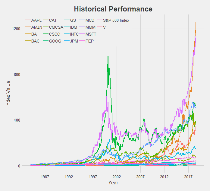
What a mess. But a good starting point! So here we have 17 different stocks, spanning a broad range of the market - financial, technology, industrial, and food sectors. I attempted to choose companies across a variety of industries that were also some of the top performers in those categories. We also have an indicator for the entire market, the S&P 500 Index, which I pulled from the ticker “^GSPC” on Yahoo Finance. This will serve as our baseline for performance as we examine each individual stock. Using the S&P 500 for comparison allows us to reduce the effect of systematic risk on the stocks we observe. That is, events that caused the majority of stocks to fall, are not caused by a single company’s actions alone, and are nearly impossible to avoid. One example of a systematic risk would be the trade war ongoing between the US and China - not caused by any company but influencing the stock price of many. Our interest is on how the individual stocks we will analyze performed relative to the market as a whole. So instead of observing a stock’s performance compared to zero, we will look at how a stock performed relative to the S&P 500 Index. Thus if a systematic even occurs, this shock will apply to the broader market and will be reflected in the S&P 500.
Another important note before jumping into the charts is my methodology. Rather than look at absolute performance of these stocks I chose to index them. This is important! To gather this data I went onto Yahoo Finance and pulled the monthly closing price for each stock. I then indexed the stock performance by dividing each subsequent monthly datapoint by a base datapoint - the first available observation of historical performance. This was done for each individual company. I then indexed our S&P 500 indicator by choosing that company’s first available month as the base point for the S&P 500 as well. So our y-axis is measuring not the actual closing price but the growth rate from the first date of the stock price to today. Thus the y-axis is labeled “Index Value”, and is derived from the closing price of the relevant stock. With that said, let’s begin!
The Tech Sector

At first glance this chart appears to be saying that Cisco (in purple) is much larger than Google (in orange), a fact that is clearly incorrect. Remember, we are looking at indexed values where we are comparing a company’s stock price today relative to its historical price, indexed at 1 from it’s first-ever closing price. So Cisco is much higher on this chart than Google because Cisco first opened at a share price of $0.08 [NOTE: this is the historically adjusted price, accounting for stock splits] and is today at $43.75 (a 56,720% increase) while Google opened at a share price of $50.85 [NOTE: again, historically adjusted price] and is today at $1,235 (a 2,273% increase). In actual value, Google has a market cap of about $840 billion compared to Cisco’s market cap of about $215 billion. Google is nearly 4x larger. So my method of indexing values makes it useful for us to compare time-series data on each company, but not very accurate for comparing across companies. This is fine since the goal of this project was to look at company’s performance over time, not to compare different companies’ performances to each other. I probably shouldn’t even include the charts that compare across companies like this tech sector one, but I think we can still find useful information from them as long as we keep in mind this disclaimer. I’ll make sure to keep bringing it up as we explore the data so that no chart is mistaken in its meaning.
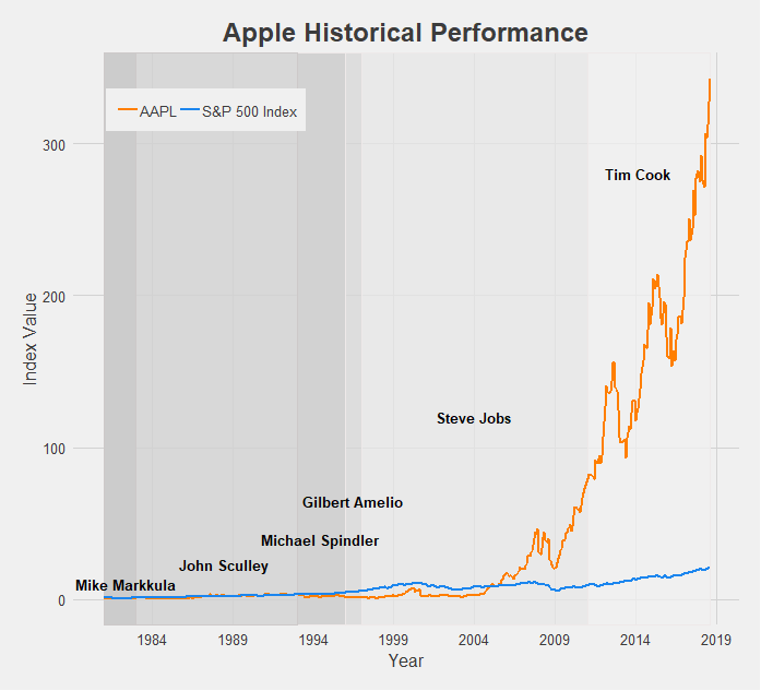
Apple’s growth is tremendous, making the S&P 500 Index look like it has barely grown by comparison. The struggles of the company pre-Steve Jobs era are apparent, as Apple was actually being outperformed by the market until the reveal of the iPhone. After that there was no looking back, and under Tim Cook Apple has become the most valuable company in the world (just recently becoming the first to reach a $1 trillion market cap).

There’s really not much to say here. Amazon is the best possible public company to have invested in for the 21st century. The growth of Amazon’s stock price, especially since 2012, has redefined the phrase “the sky is the limit”. It’s made the growth of the S&P 500 look like a flatline by comparison. With Jeff Bezos at the helm, Amazon has achieved the highest index value of this dataset. In just over a decade and a half it has grown over 1200x it’s original price. Let that sink in. If/when Jeff Bezos steps down, the CEO chosen to fill his shoes may have an impossible task ahead of them.

Comcast is another company that has undergone impressive growth post-recession. For its entire existence it has been managed by the Roberts family, current CEO Brian being the son of founder and original CEO Ralph. Following a long period of turbulence from 2000 to 2010, Comcast found its footing and expanded into the (perhaps not very-liked) corporate machine at the top of the media world today.
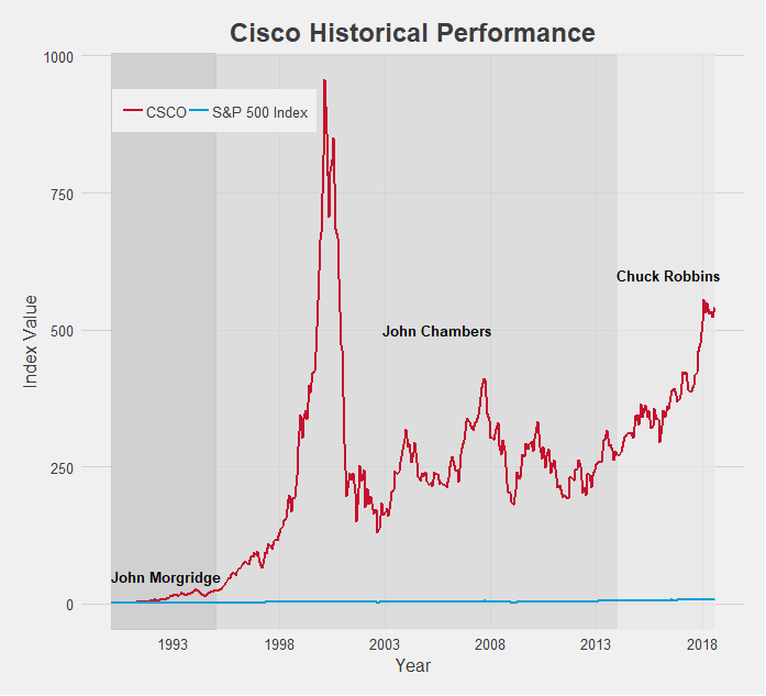
Cisco is another tech company that experienced explosive growth. In fact, it’s 2001 peak, nearly hitting 1000x the stock price since it’s open, is among the highest index value of all the data I collected. The subsequent pop of the dot-com bubble brought it back down to earth, but under CEO Chuck Robbins, Cisco has maintained a very appealing growth rate.

In terms of time being publicly traded, Google (now known as Alphabet, Inc.) is a very young company. As a result its index value is a bit lower compared to some of the other tech companies, but you have to keep in mind the short time frame. 25x growth since 2004 is spectacular, and when accounting for its actual market cap the real size of Google is revealed. Relative to the S&P 500 which grew only about 3x in that same time period also provides a more impressive indicator of Google’s dominance.

IBM has been around for a long time, especially for a tech company. Since 1962 it has gone through 8 different CEOs and in those 56 years experienced mixed growth rates. Hard times recently have been plaguing IBM’s growth as the S&P 500 has widened the gap in performance.

Intel is another company that displays the impact of the early 2000s dot-com bubble. Like Cisco it grew incredibly fast and incredibly large, crashing just as quickly as it rose and has not quite yet reached that 2001 level. Still, under CEO Brian Krzanich’s guidance the company achieved excellent growth. It’s index value practically doubled in less than 5 years! With new CEO Bob Swan just starting earlier this year, it remains to be seen if Intel can sustain that growth rate

Last among the tech stocks is Microsoft. Microsoft’s chart also perhaps provides the clearest indication of a connection between CEO and stock performance. Under founder Bill Gates, Microsoft exploded (although also helped along by the dot-com ubble) and hit the 600x growth mark at the turn of the century. When Steve Ballmer took over this growth floundered, unable to break out of the 300x range. But current CEO Satya Nadella has helped Microsoft rediscover that Gates-era magic and reach new highs. As a result Microsoft is one of the best performing companies by growth, only getting beaten by Amazon.
Next up is the financial sector, but seeing as how long this post has already gotten, we’ll save it for Part II. To be continued…
Final Comments
All historical stock performance data was pulled from yahoo.finance.com. Performance was pulled as monthly data, selecting for closing price. Dates for CEOs were found using simple Google searches, and so may be slightly inaccurate. Start and end dates pulled from official company website where available and found.
Data was then imported in STATA, where I cleaned it and merged in S&P 500 Index data. Values were then indexed to oldest closing date and using a simple growth formula [(closing price at date N)/(closing price at date 1)].
The datasets were then exported and brought into R. All visuals were made in R, using the following packages: readr, ggplot2, dplyr, RColorBrewer, ggthemes, tidyverse, stringr. I styled my charts after one of my favorite websites, FiveThirtyEight, using the ggtheme of the same name.
You may have also noticed that the line colors for each company are that company’s logo colors! Credit to http://www.codeofcolors.com/brand-colors.html for providing the hex color codes for each company. Also credit to http://www.stat.columbia.edu/~tzheng/files/Rcolor.pdf and colorbrewer2.org for providing additional color schemes and R color information.
Additional parts featuring other sectors will be follow soon! If there are any companies you'd like me to take a look at, leave a comment, shoot me an email, or fill out the inquiry form on this website.