
The street I live on in Philadelphia is lined with French restaurants and American bistros. Since these restaurants received the okay to reopen for outdoor dining, this street has been full of diners crowding the hastily set-up tables. All these establishments have basically been turned inside out, their interiors serving solely as facades for the sidewalk now converted into a dining area. Walking down my street, I’ve been wondering about the amount of business these restaurants take in, in the new COVID-19 world. And this ties into another aspect of the current Philly summer life - frequent thunderstorms. Once a minor inconvenience for the city’s restaurants, rain now imposes a harsh limit on their ability to operate. If customers can only eat outside, there’s not going to be much demand on rainy days. But how significant is the weather on consumer traffic to businesses, restaurants and otherwise, and are weather conditions something businesses will have to incorporate into their forecasts while indoor restrictions remain commonplace? While I sadly don’t have access to the daily cash flows of local businesses, there are a number of publicly-available proxies for measuring the day-to-day expenditures at Philly establishments.
First Glance at Business Activity
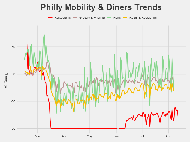
One excellent source for measuring business activity and consumer habits on a daily basis is Google Mobility Reports. Google has generously provided their collected data from users’ location tracking devices, compiled into daily reports of changes in visits relative to a baseline period to various areas of interest. As Google puts it, “The data shows how visitors to (or time spent in) categorized places change compared to our baseline days. A baseline day represents a normal value for that day of the week. The baseline day is the median value from the 5‑week period Jan 3 – Feb 6, 2020.” So using this measure doesn’t give us an exact picture of the daily level in consumer activity, but it’s close enough for a guy who’s writing a casual post about a random question he had one day. That being said, let’s look at the data for Philly:

We’ve got three categories here: consumer traffic to grocery and pharmaceutical stores, to parks, and to retail and recreation stores. It’s a bit noisy, especially in regards to the parks, which have relatively large high-frequency fluctuations - probably due to the day of the week (week vs. weekend) - and perhaps a first signal of the effect of local weather. This noise is exactly what we want: variation in the time series data that we can exploit to determine if there’s any particular correlation with the weather. For graphing purposes, however, such as viewing the general trends and major differences between the categories, smoothing the data is preferable.

Long-term trends are much more clear here. Parks and retail, which are more optional activities, took bigger hits in April when pandemic regulations were the tightest. Parks have had an especially pronounced rebound since then, which is likely in large part due to improved weather in Philly (this is also likely why traffic was so high in late February, relative to the particularly frigid January-early February period). When the pandemic began winter was still going, and the reopening of public spaces coincided with the warmer spring and summer weather. On the other hand, traffic to grocery & pharmaceutical stores, sellers of much more essential goods, remained relatively stable, though still below pre-pandemic levels. Anyways, we’ll be using the data in it’s raw, noise-filled form for analysis from here on out.
Another useful and graciously shared dataset is OpenTable’s data on seated diners at restaurants. This data is also relative, this time showing the percent change relative to the same day a year ago (year-over-year change).
The damaging impact of the pandemic on restaurants is apparent. Even with the reopenings and relatively low COVID-19 case counts in Philly, visits to restaurants remain way below baseline level. We’re also seeing a fair amount of variation since the mid-June reopenings, with several pronounced dips occurring semi-regularly. One of those dips is due to the July 4th holiday - but could the other ones be responses to rainy days?
Identifying Rainy Days
Now that we’ve got our trends, the next step is actually examining the weather. Using the National Weather Service’s data, we can identify exactly which days in Philadelphia it rained.

Days shaded in blue are days when rain was recorded in Philadelphia; that’s a lot of rainy days. I’m also excluding here the days that have a “trace” amount of rain - .01 inches or less. Lining up the dips with those rainy days, it looks like some dips line up with the rain, some don’t. But overall it’s hard to tell, and besides that, some simple chart comparisons aren’t enough to make anything besides educated guesses. For real insight, we’re going to need to do some actual economic analysis.
A Drop of Analysis
There are, of course, a number of methods available to determine if rain had a significant effect on the traffic to restaurants (we’ll be focusing on just restaurants from here on out). One simple and direct method is to run a linear regression of diner traffic on a dummy variable for rainy days. Doing this for our data beginning mid-June (when reopenings began) provides the following results:
Coefficients: Estimate Std. Error t value Pr(>|t|) (Intercept) -74.4886 0.9363 -79.56 < 2e-16 ***raindays$rain_flag -6.4358 1.7826 -3.61 0.000654 ***The above coefficients table tells us that on sunny days, diner traffic averaged -74.5% relative to the same day a year ago, and on rainy days traffic dropped to about -81%. So rain was responsible for a 6.4% drop in business to restaurants and (as indicated by the low p-value) this difference was certainly significant.
Compare these results to the same regression run on the data for February to mid-March, before the pandemic came to Philly:
Coefficients: Estimate Std. Error t value Pr(>|t|)(Intercept) 0.8421 4.7802 0.176 0.862raindays$rain_flag -2.1278 9.2127 -0.231 0.819Before restaurants shifted to outdoor-seating only, the effect of rainy days was only a 2.1% drop in diner traffic - not a large enough difference from the sunny days to be considered significant (for this time period, diner traffic averaged 0.8% higher than the same period a year ago).
One other way we can test for significance in the difference between rainy and sunny days is with a difference of means test. Specifically of use, in our case, a Wilcoxon test that does not assume anything about the underlying distribution of our sample. Difference-of-means tests, as the name implies, determines whether the averages of two groups are significantly different from each other. Running two of these - a two-sample t-test and a Wilcoxon test - on our post-pandemic data results in:
t-Test
t = 2.4544, df = 15, p-value = 0.02681alternative hypothesis: true difference in means is not equal to 0Wilcoxon Test
W = 171.5, p-value = 0.004328alternative hypothesis: true location shift is not equal to 0Both these tests have p-values below .05, indicating that the difference in average diner traffic between rainy days and sunny days is significant. As before, we can run the test on the data pre-shutdowns to see if this is pattern is novel to the reopening period.
t-Test
t = 4.7013, df = 6, p-value = 0.003322alternative hypothesis: true difference in means is not equal to 0Wilcoxon Test
W = 69.5, p-value = 0.885alternative hypothesis: true location shift is not equal to 0While the t-test actually says there is a significant difference here as well, the Wilcoxon test (with a p-value of 0.885) strongly rejects any difference between the means. Given that our data is very likely not following a normal distribution (as assumed by the t-test), we’ll hold the results of the Wilcoxon test in higher esteem.
Conclusions
The above results together support the notion that the shift in dining policy due to the pandemic has created a new dynamic - one where the possibility of rain is now a notable detriment to restaurants’ success. Moving toward the colder seasons, it’ll be interesting to see how inclement weather may continue to have an outsized impact on restaurants relative to pre-pandemic effects. Sitting under an umbrella in a summer rain with 80-degree weather is one thing, but sitting outside when it’s snowing and/or below 30 degrees is another. If COVID-19 remains through early 2021, we may see eating establishments (outside of the warm southwest) in the US struggle with the additional burden of effective closures or diminished traffic on days where diners aren’t willing to brave the weather for a bite to eat.
One last note is not to take the results of the above tests too seriously. First off, the sample sizes are way too small, and the tests I ran are very surface level. Including more explanatory variables in the regression would likely change the results and are one of many additional steps that could be taken to lend results greater legitimacy. While my results may provide a hint of significance, they are only small dips into the real type of analysis that needs to be done to properly establish causation. However, I also don’t think it’s too much of a stretch to conclude that bad weather might prevent a significant portion of people from going out to eat when their only option is to eat outside - in that bad weather. Time, and local weather conditions, well show if this turns out to be true.
Final Notes
Thank you to Google, OpenTable, and the National Weather Service for making the data used in this post publicly available.
Charts seen in this post were made in R using the ggplot2, tidyverse, readxl, and Cairo packages.
A very useful resource for determining which difference of means tests to run and how to do so in R was https://uc-r.github.io/t_test.
An always-helpful resource for picking complementary colors in charts (used in many of my previous posts as well) was https://coolors.co/. Thank you to the folks at Coolors, as well as my friend Vanessa Wong, for advice on creating charts pleasing to the eye.
If you have questions or constructive feedback, feel free to email me at troded24@gmail.com, submit an inquiry on this website, or leave a comment on this post! Thanks for reading.